Overview
CONTEXT
Improving the online music lesson experience
Online music lessons surged during the COVID-19 pandemic out of necessity, demonstrating to teachers and students that online lessons are a viable option when in-person lessons aren't. According to Astute Analytica, the global online music education market is expected to more than quadruple from 2022 to 2027.
With online music learning here to stay, how can we enhance the online music lesson experience for teachers and students?
Market growth projection for online music education
MY ROLE
End-to-end product designer
TIMELINE
May 2022 - 4 weeks
TOOLS
Zoom, Miro, Figma
Defining the Problem
INTERVIEWS
Managing online lesson limitations cause workflow inefficiencies for teachers
I interviewed 6 music teachers (piano, violin, and voice) about the types of tools they use and issues they face in the online lesson format compared to in-person.
Interviews revealed that teachers had to find workarounds through various apps and resources to overcome online lesson limitations which led to workflow inefficiencies.
CUSTOMER MINDSETS
“The Techie” and “The Traditionalist”
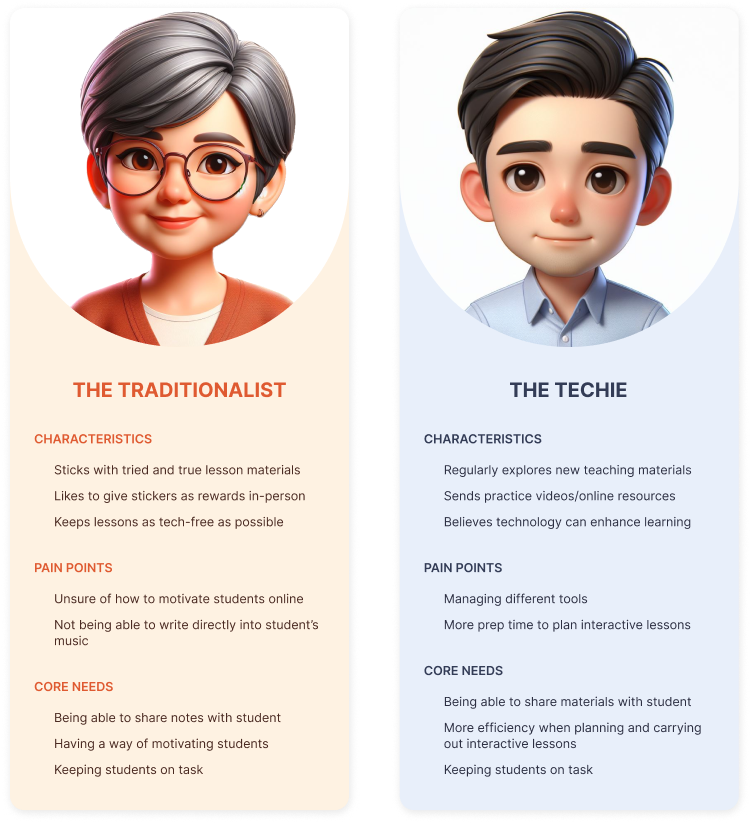
I noticed a divide among teachers regarding their willingness to integrate technology into online lessons. Some fully embraced it (“The Techie”), aiming for more engaging lessons, while others preferred to keep things analog (“The Traditionalist”), prioritizing a simpler workflow.
THE PROBLEM
Music teachers face the challenge of juggling various apps and resources to overcome online lesson limitations and engage students. This creates additional stress for teachers and results in less productive and effective lessons due to an inefficient and complex workflow.
Defining the Solution
COMPETITIVE ANALYSIS
Comparing score reading apps: forScore vs Newzik
I looked at two popular score reading apps among musicians, forScore and Newzik, since both customer mindsets would benefit from music annotation capabilities.
Both apps offered basic annotation, scanning, metronome, and tuner tools that met teachers' core needs to organize and annotate students' music. However, Newzik stood out with its real-time collaboration ability.
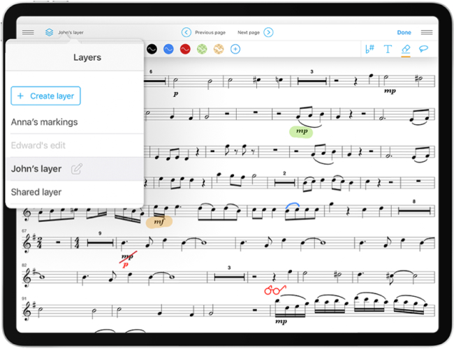
Screenshot of Newzik's "shared layer" feature
Exploring features of classroom management apps
I also looked at classroom management apps to identify any other interesting features that could help teachers engage students during the lesson and share their materials better.
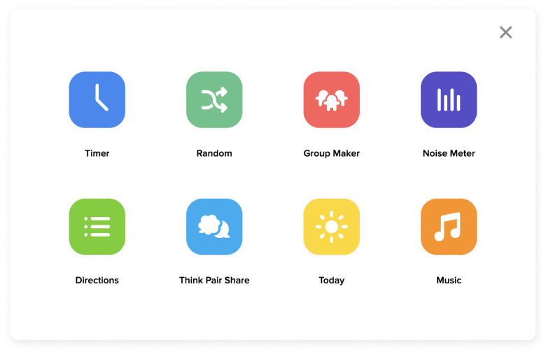
ClassDojo features a toolkit to engage students
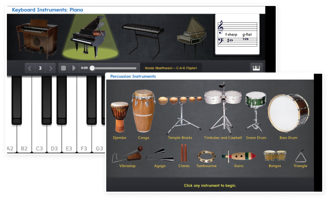
McGraw Hill’s Music Studio provides virtual instruments
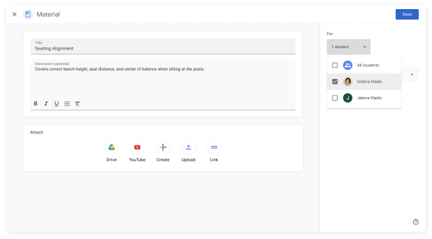
Google Classroom allows materials to be assigned to multiple students
HMW STATEMENTS
Brainstorming features for both customer mindsets
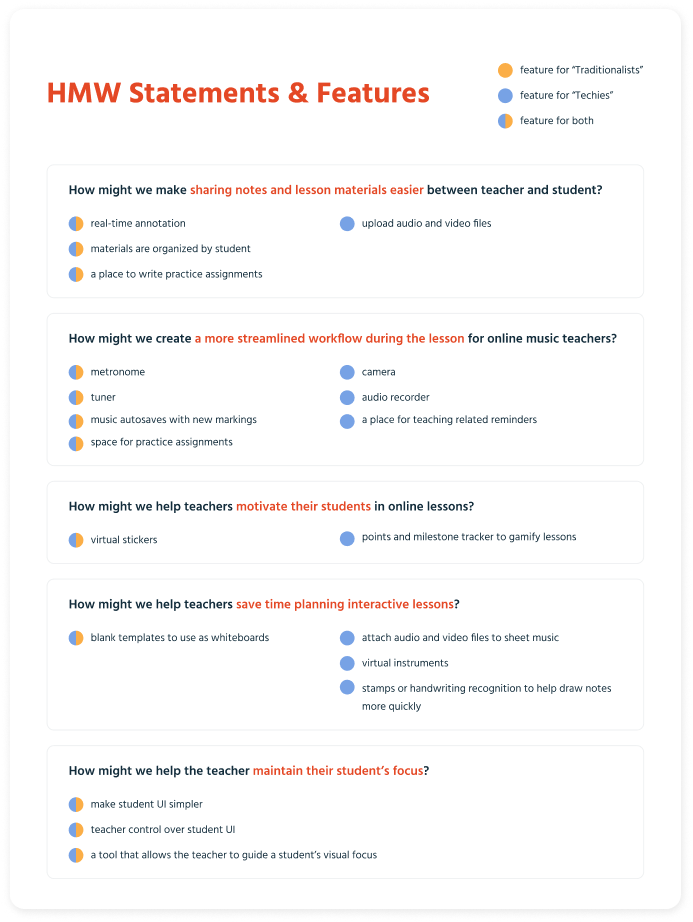
Using 'How Might We' statements, I brainstormed features to meet the core needs of each customer mindset. "Traditionalists" would require features mimicking basic in-person lesson activities, while "Techies" would need extra features for lesson gamification and integrating multimedia resources.
Designing the Solution
WIREFLOWS
Mirroring the in-person lesson experience
I created wireframes to outline how the teacher would navigate through core tasks, mirroring interactions of an in-person lesson.
Inviting the student into the lesson room
Handing off a writing tool to the student
Rewarding the student with a sticker
WIREFRAMES
Preparing a mid-fidelity prototype for testing
I translated my wireflows to a mid-fidelity prototype for testing so that I could catch any major usability issues before refining the UI further.
Iterating on the Solution
USABILITY TESTING
Improving findability of the share tool button and access to student settings
I conducted in-person moderated usability tests with 5 music teachers. Overall, the average ease of use rating was 4.35 out of 5 and 100% of the participants were able to complete all the tasks. However, some struggled to locate the share button and access student settings. I recreated the key mid-fidelity screens to address these issues.
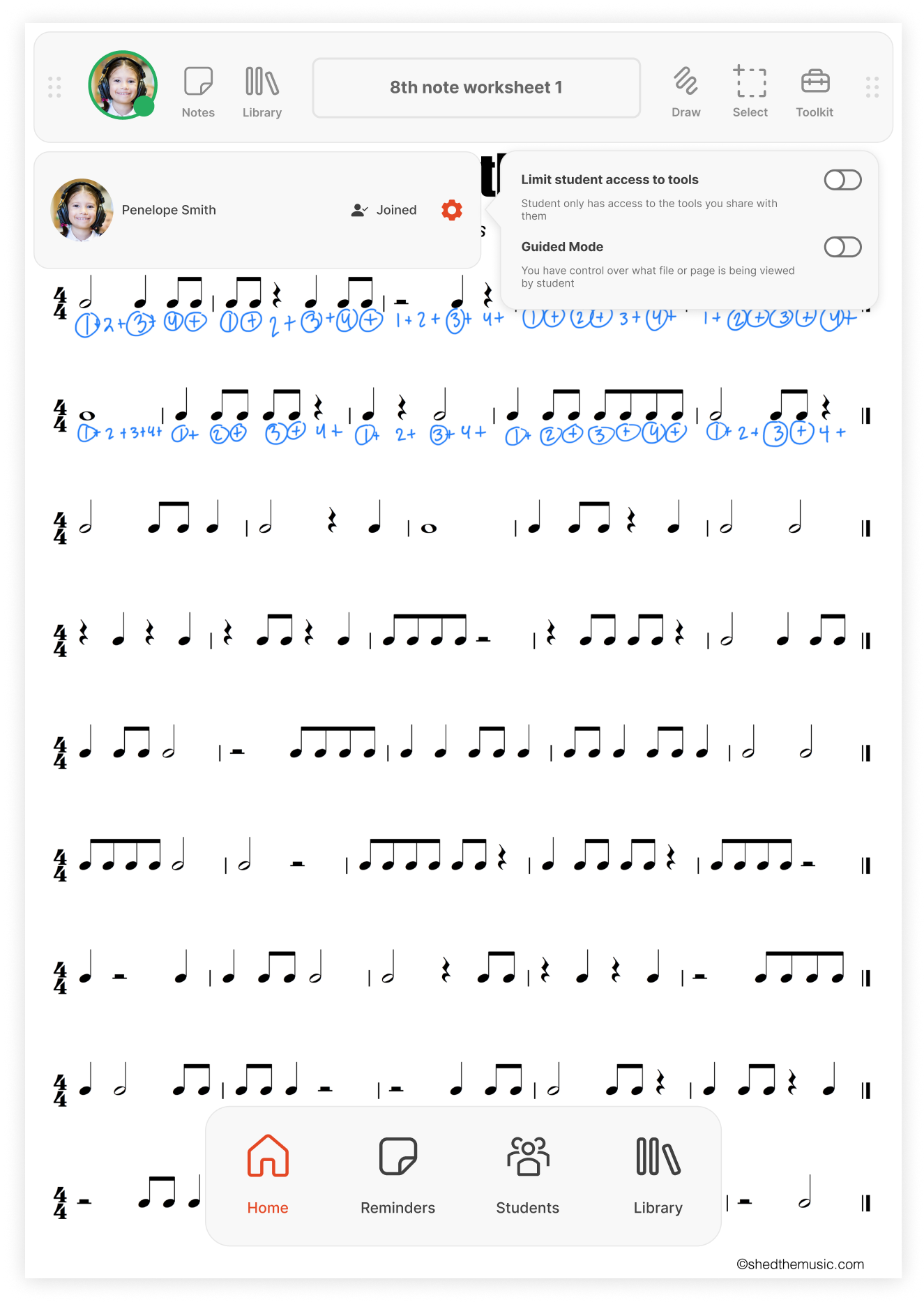
Problem
Many users (40%) struggled to find the student settings because they were hidden within the student profile icon, which was the only way to access those settings.
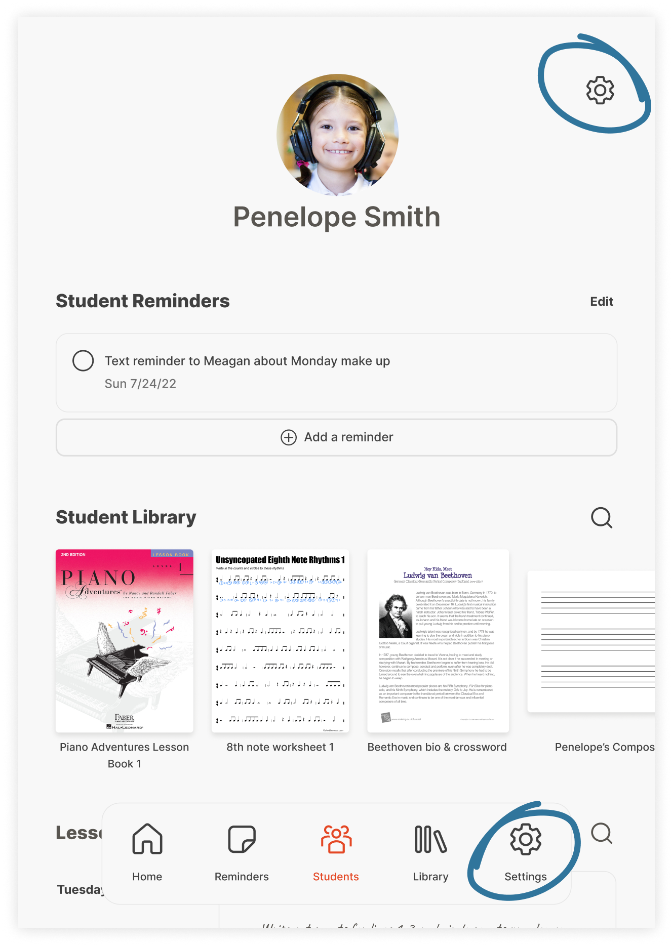
Solution
I added access to student settings in two locations: the bottom navigation menu and the student profile screen. This change allows teachers to adjust settings without having to open a lesson material first.
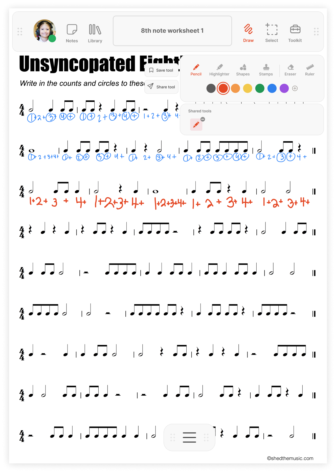
Problem
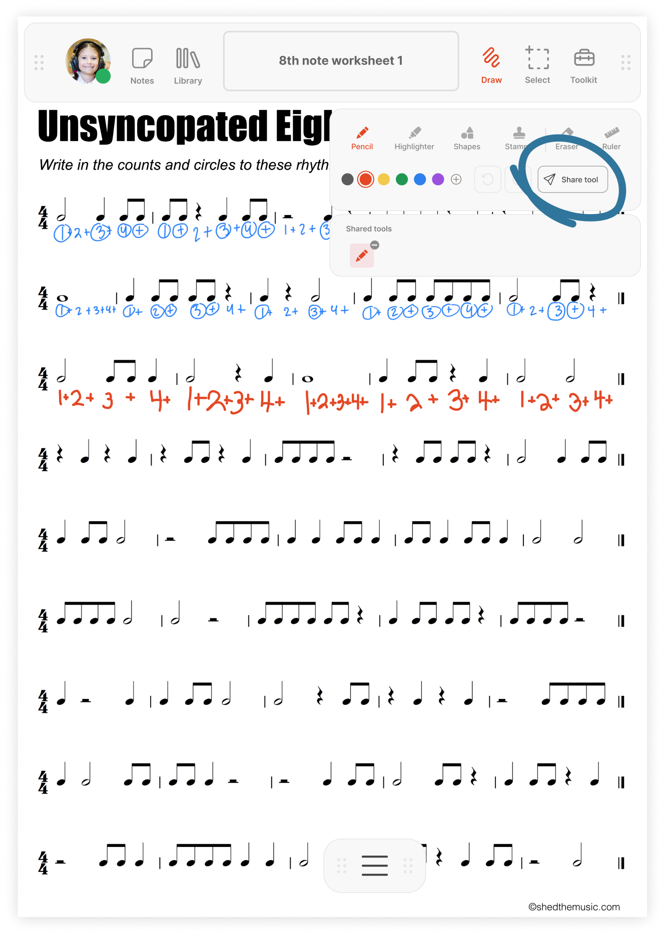
Majority of users (60%) had difficulty finding the “Share tool” button because it was inconspicuously floating beside the drawing toolbar.
Solution
The 'Share tool' button was also placed in the drawing toolbar for better visibility. The 'Save tool' button was removed to make the 'Share tool' button the primary call-to-action.
UI DESIGN
Finalizing the UI design
For the final UI design, I used a simple color palette to prevent users from getting distracted while viewing materials in the app. I also included neumorphic writing tools like those found in Apple's iOS markup tool, to give students and the “Traditionalist” teachers a more tactile experience.
Color palette
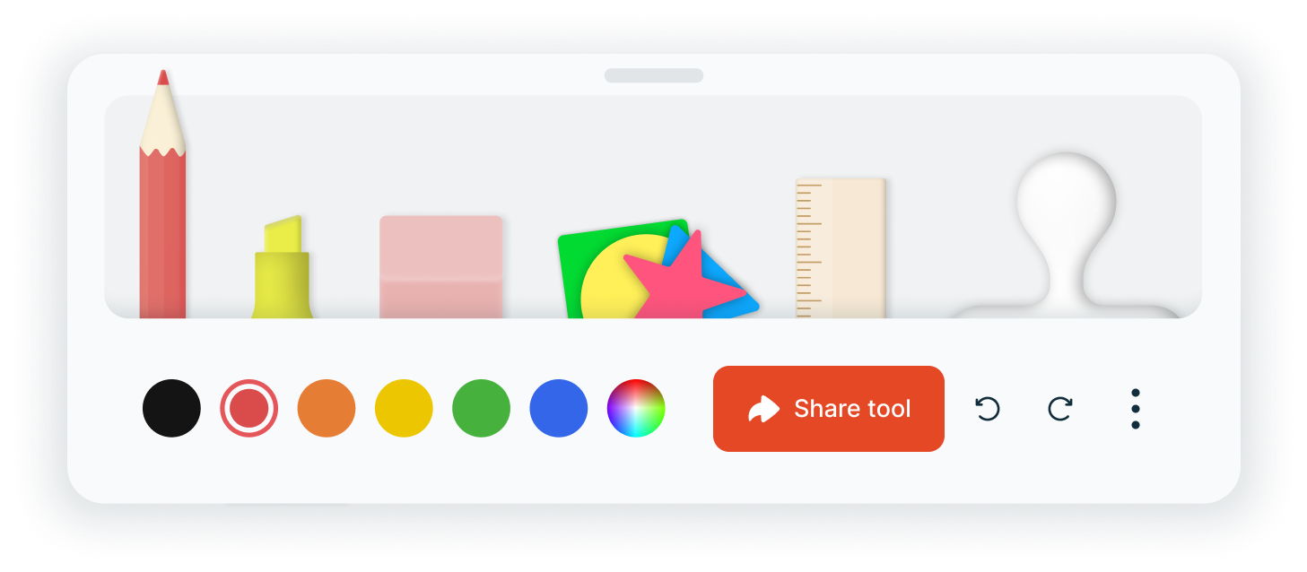
Neumorphic writing tools
The Final Solution
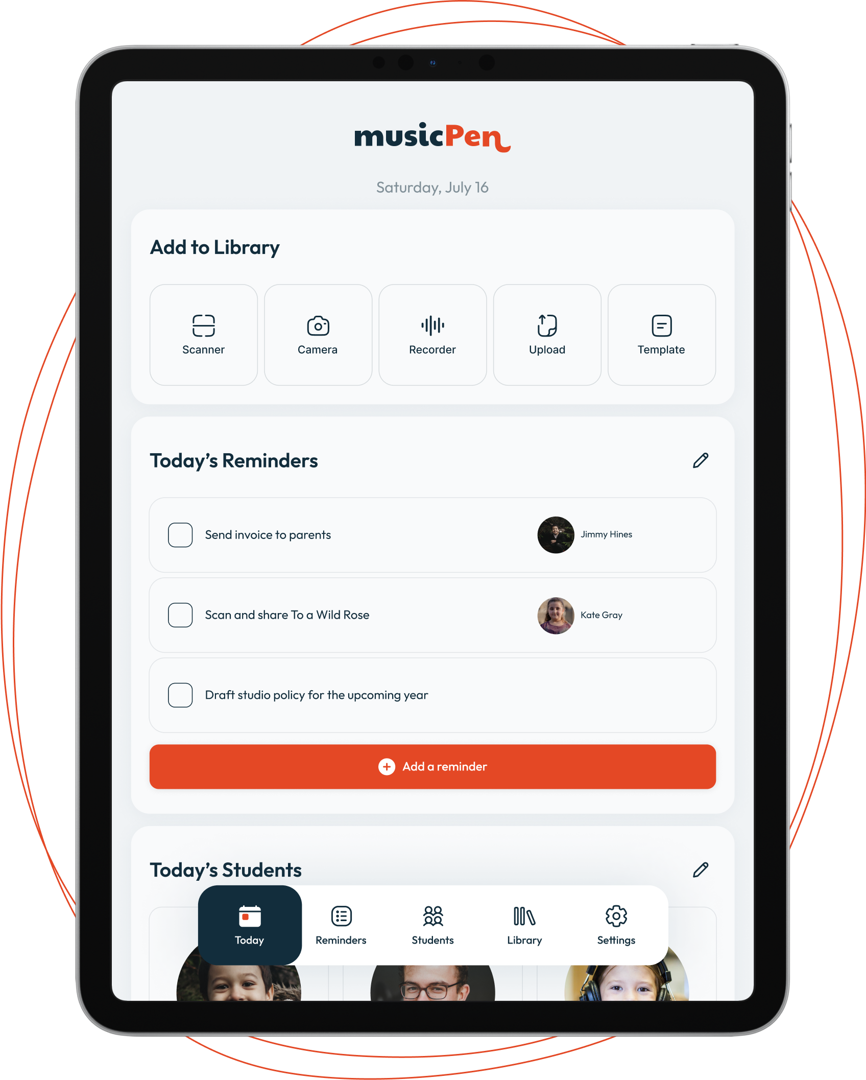
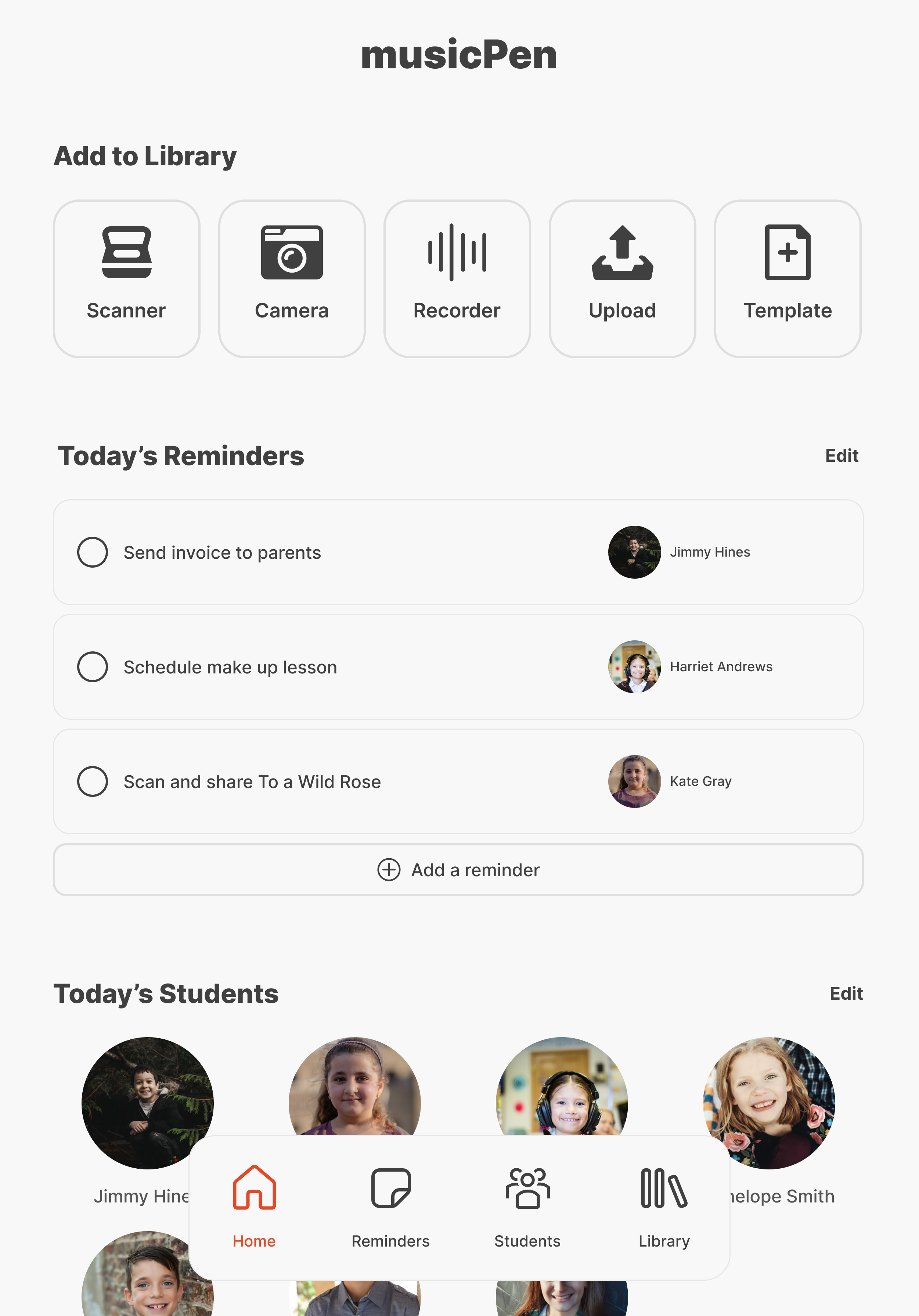
Today screen provides a daily overview
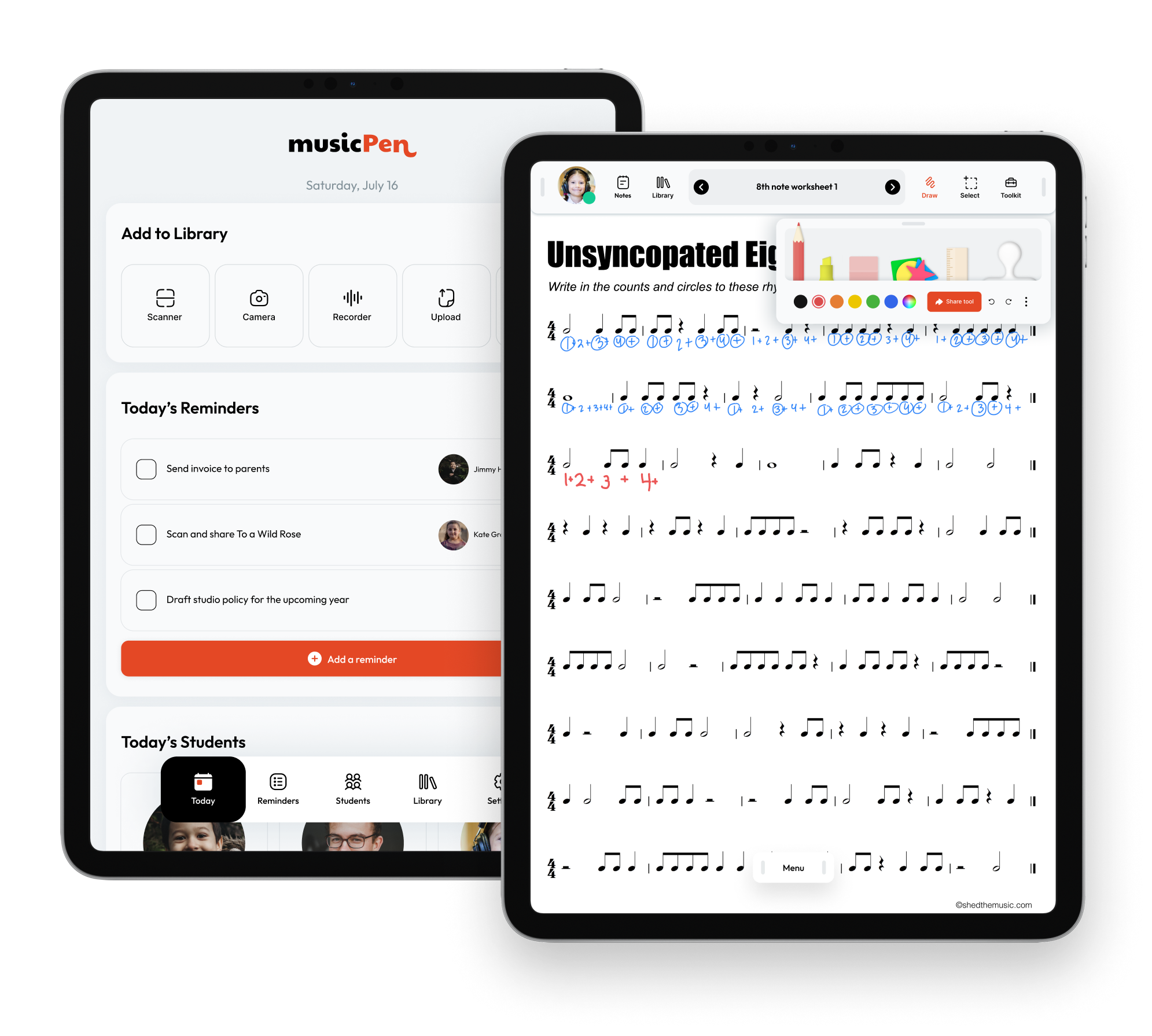
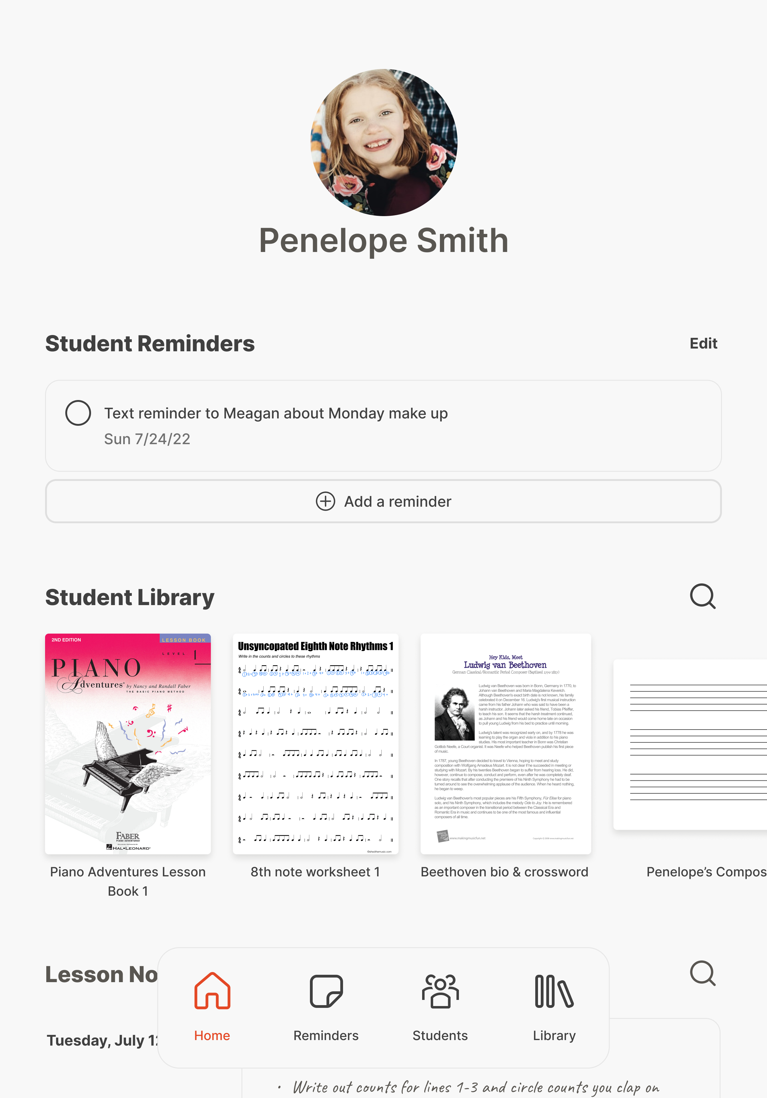
The home screen provides an overview of students and tasks for the day and also allows the teacher to add content to their teaching library via the "Add to Library" buttons.
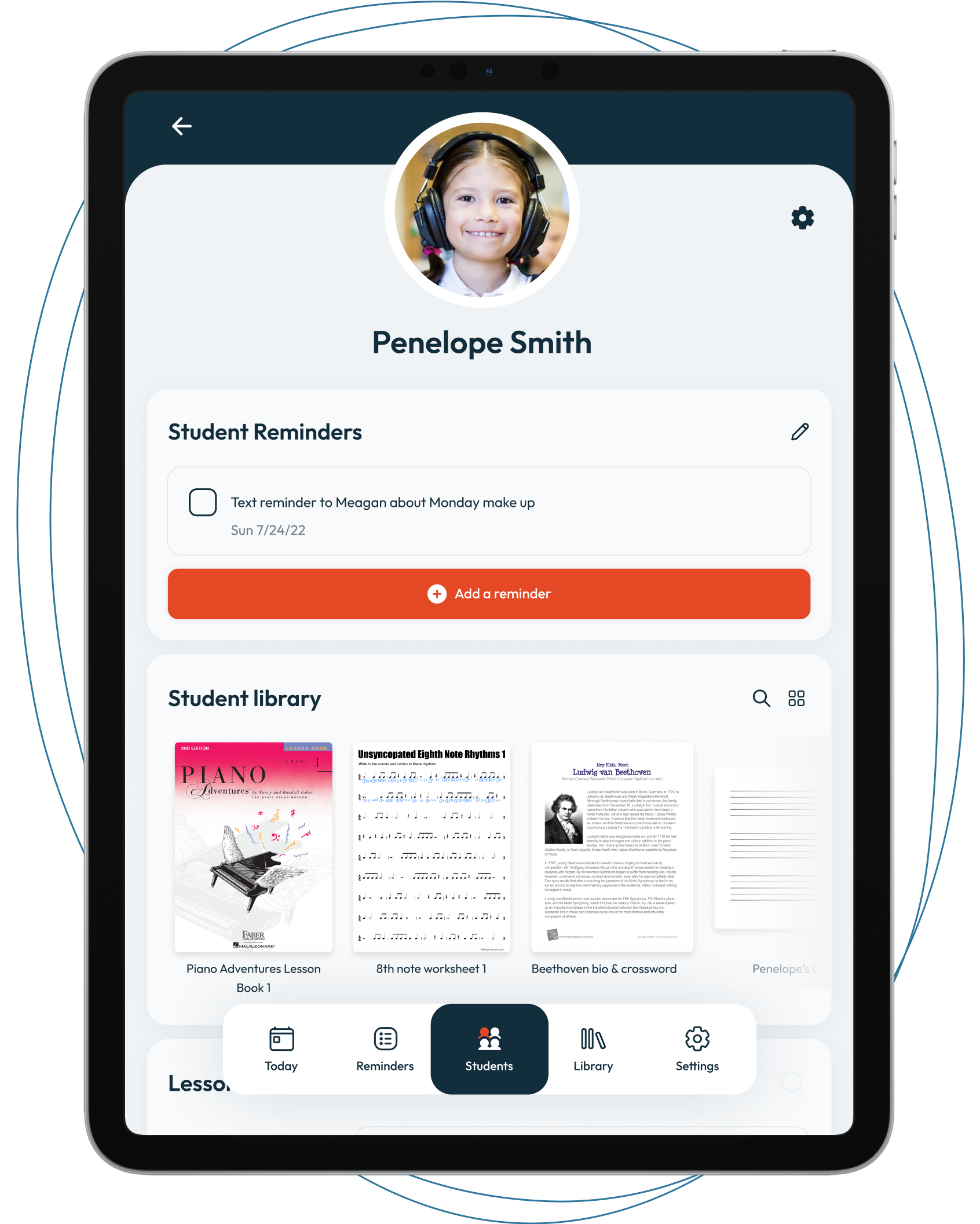
Materials and tasks are organized by student
Each student page consolidates the materials and tasks relevant to that student, reducing time spent organizing teaching resources.
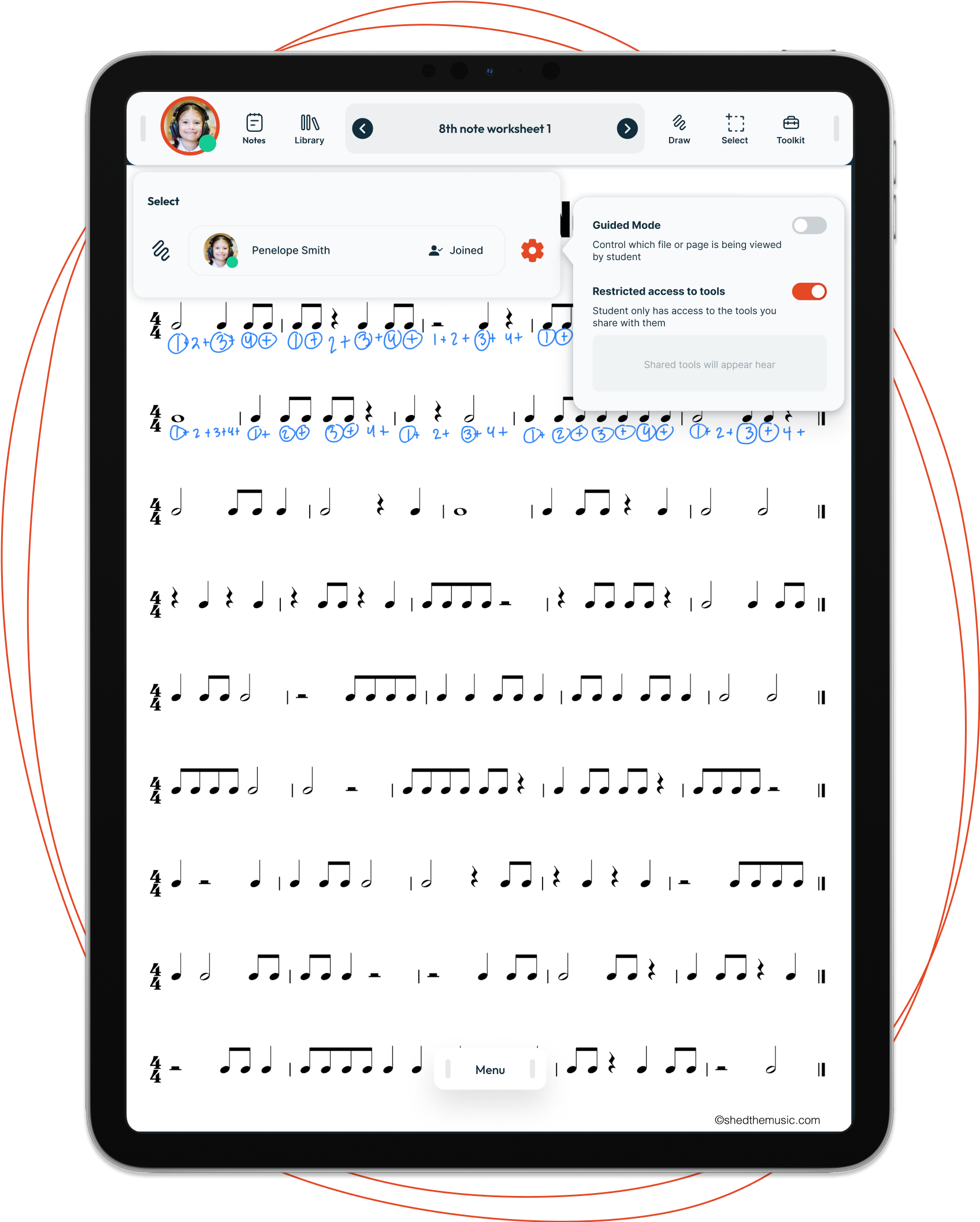
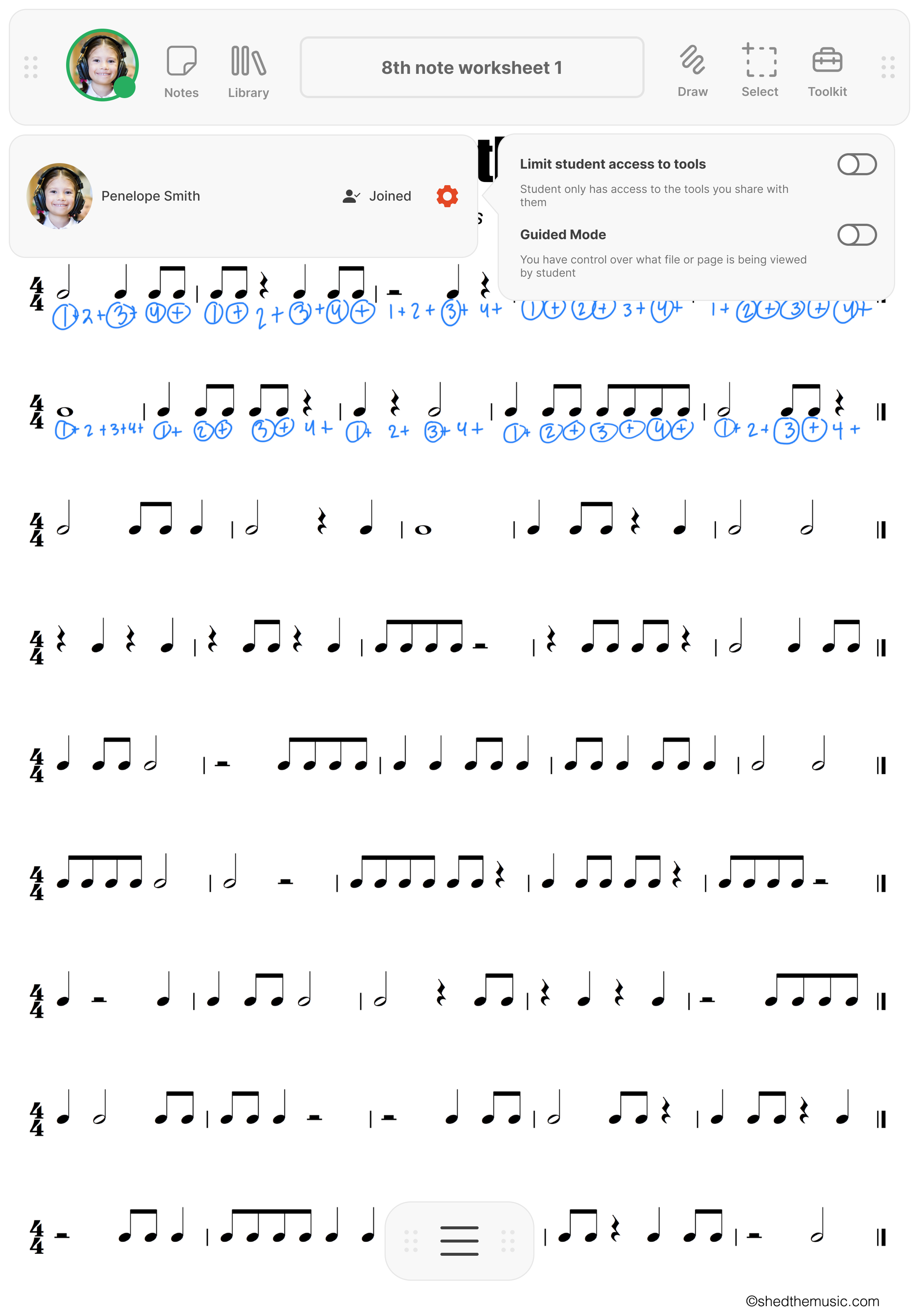
Control over student UI for easier classroom management
The teacher manages and controls what a student sees and what tools they can access in their UI in order to promote greater focus and aid classroom management.
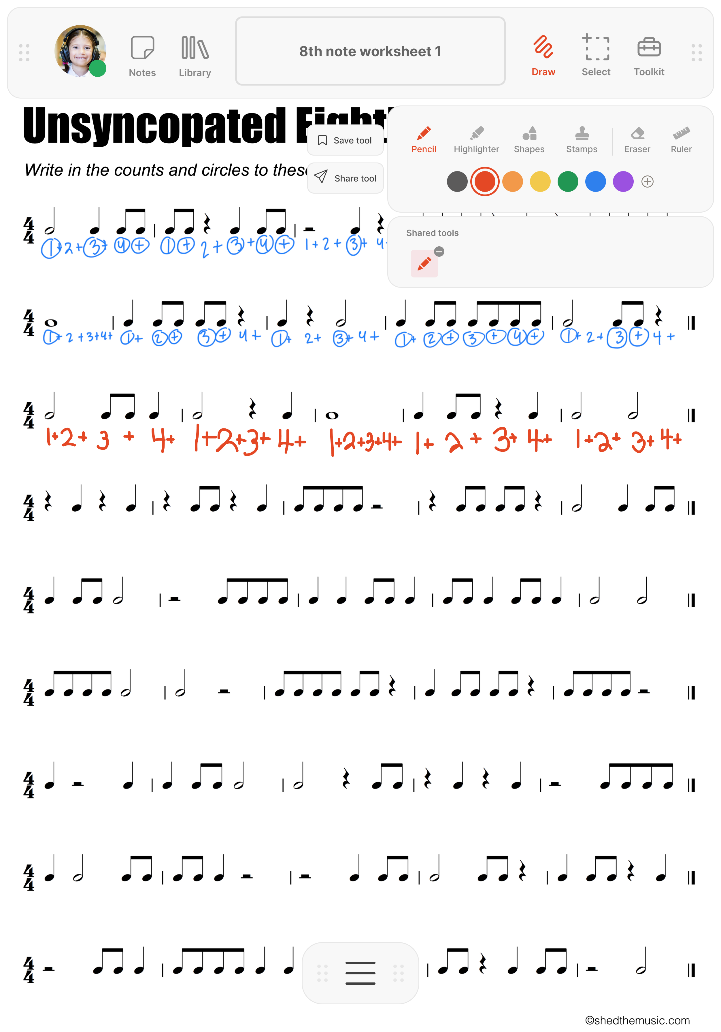
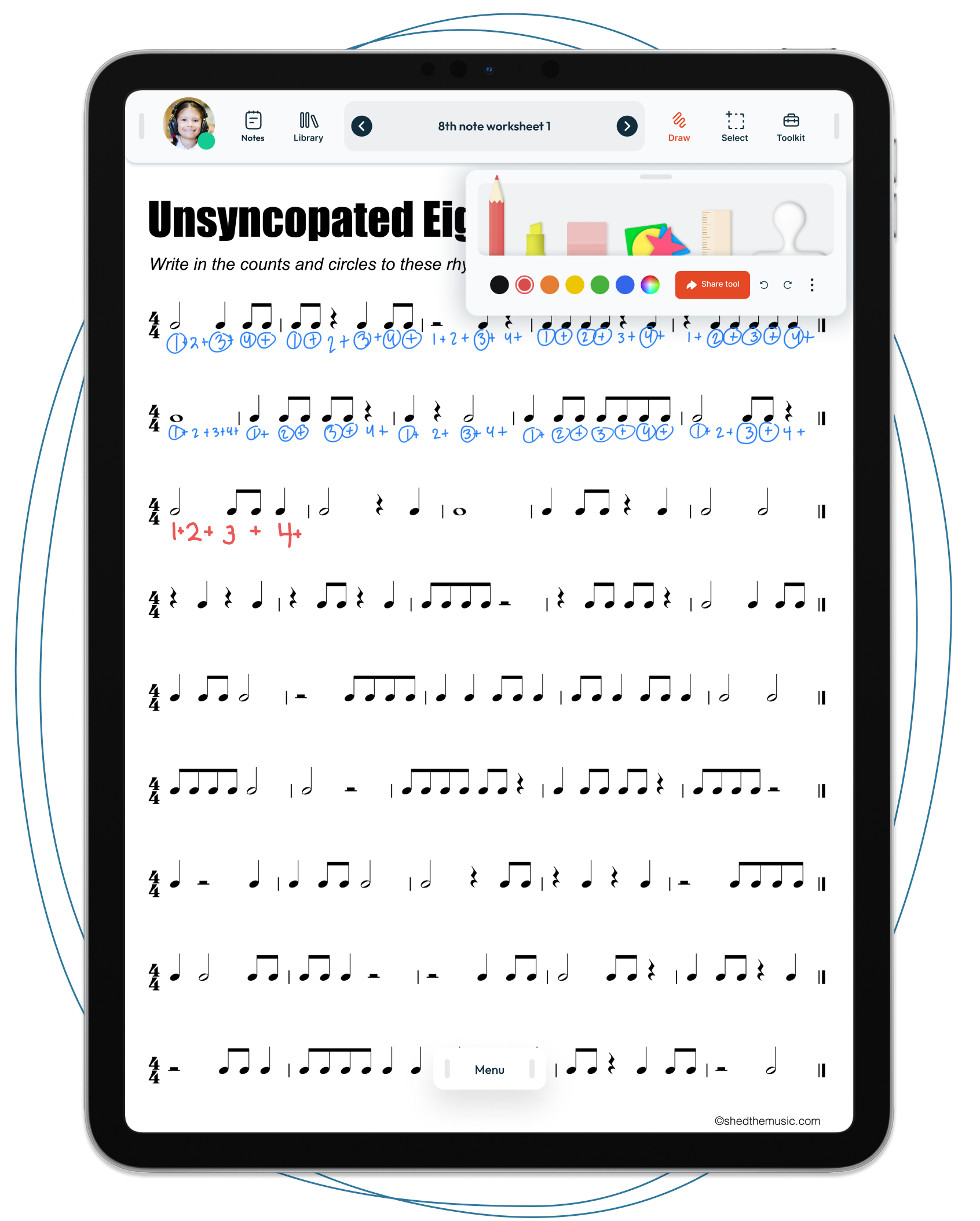
Real-time collaboration between teacher and student
The page regularly refreshes to reveal the teacher's and student's annotations and actions. The teacher can write on the music as they would during an in-person lesson.
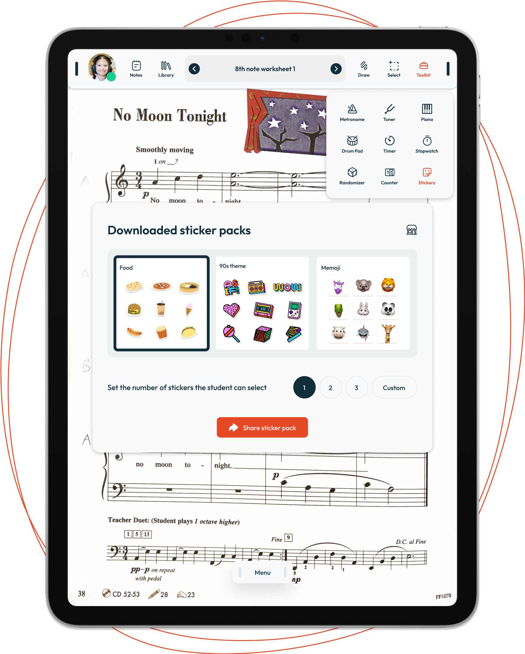
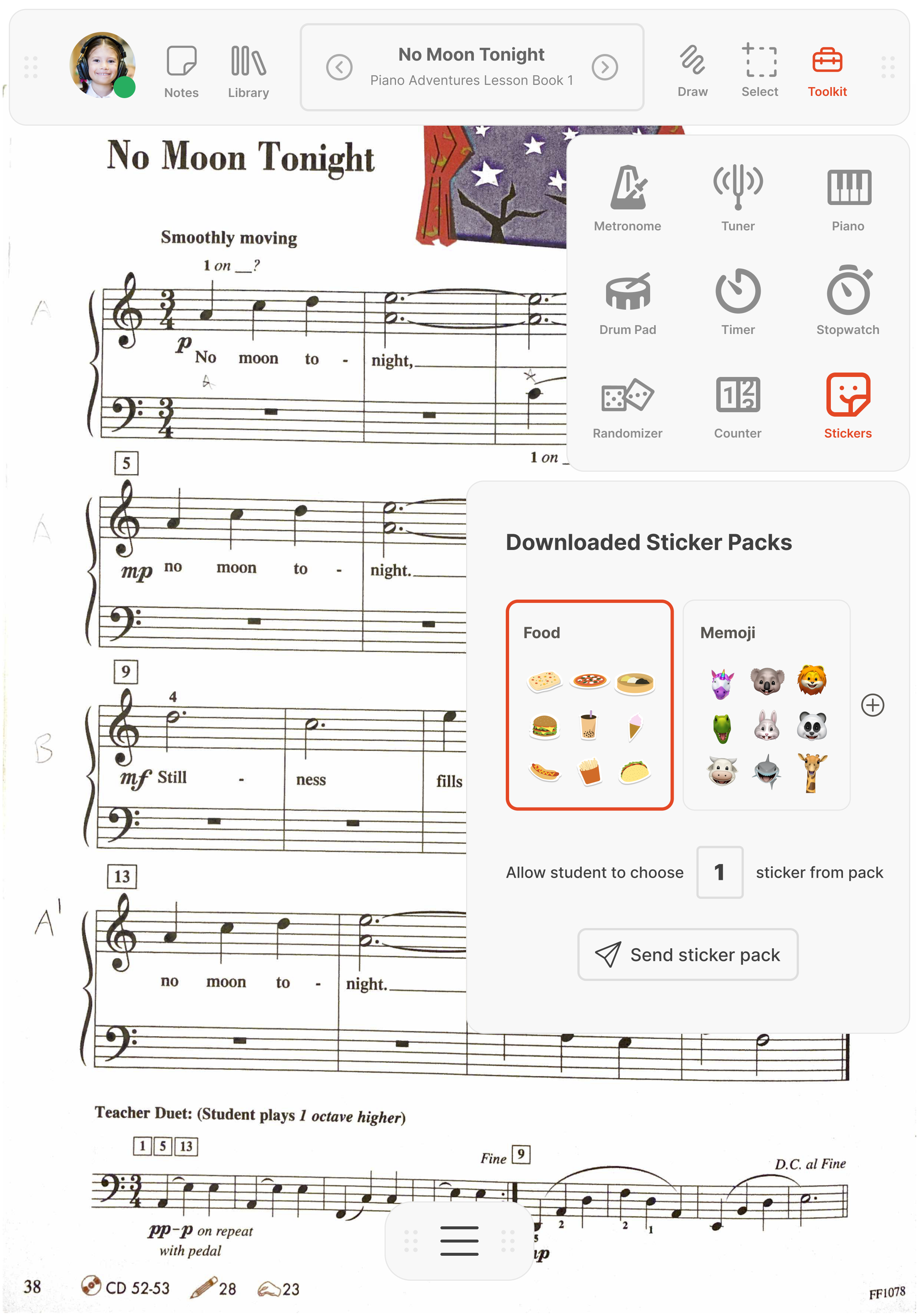
A versatile toolkit for various lesson activities
The toolkit includes various tools beyond the standard metronome and tuner, such as a randomizer, counter, drum pad, piano keyboard, and the ability for students to select and place stickers on their music as rewards.
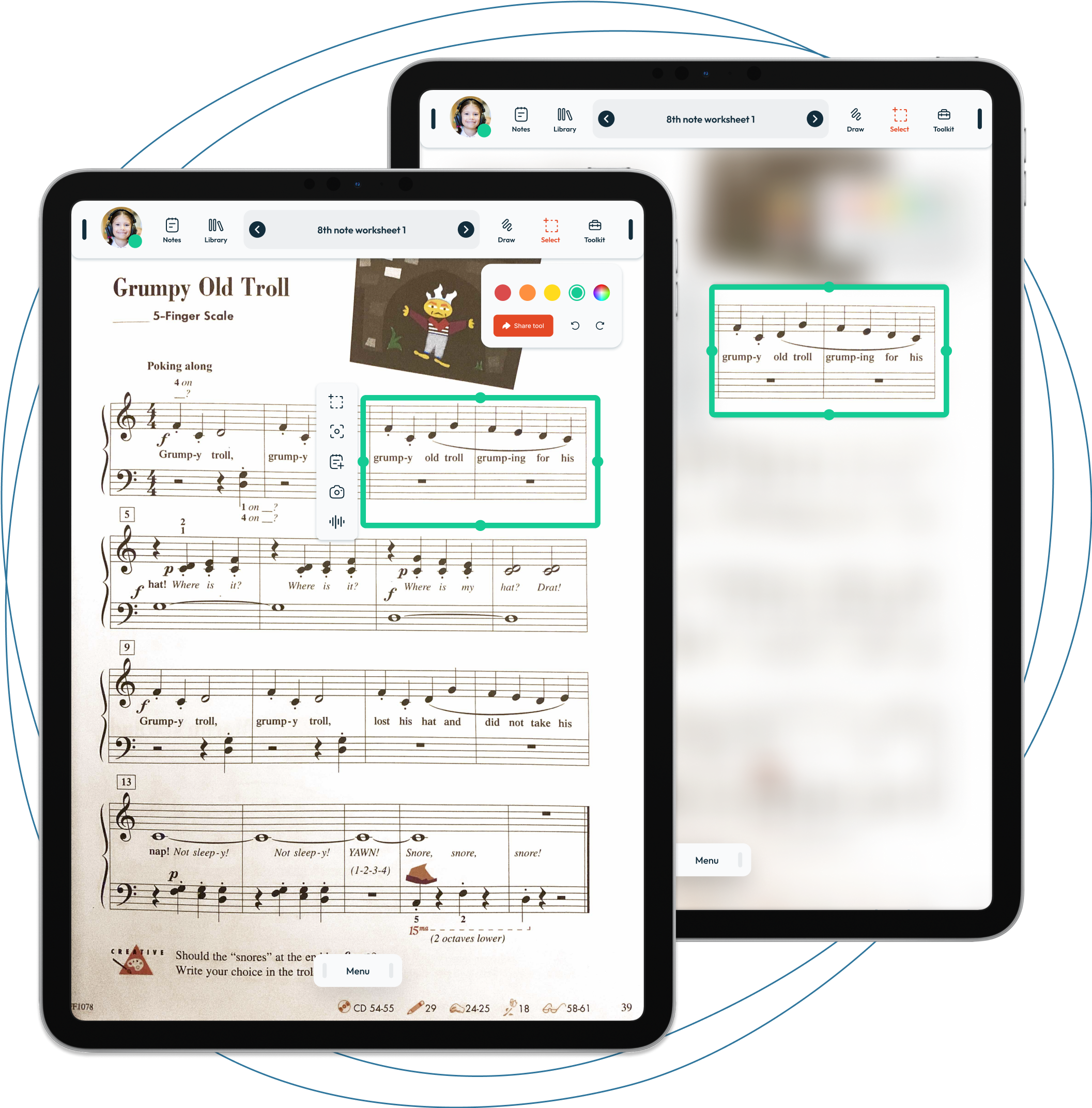
A select area tool to attach media, notes, and visually guide students
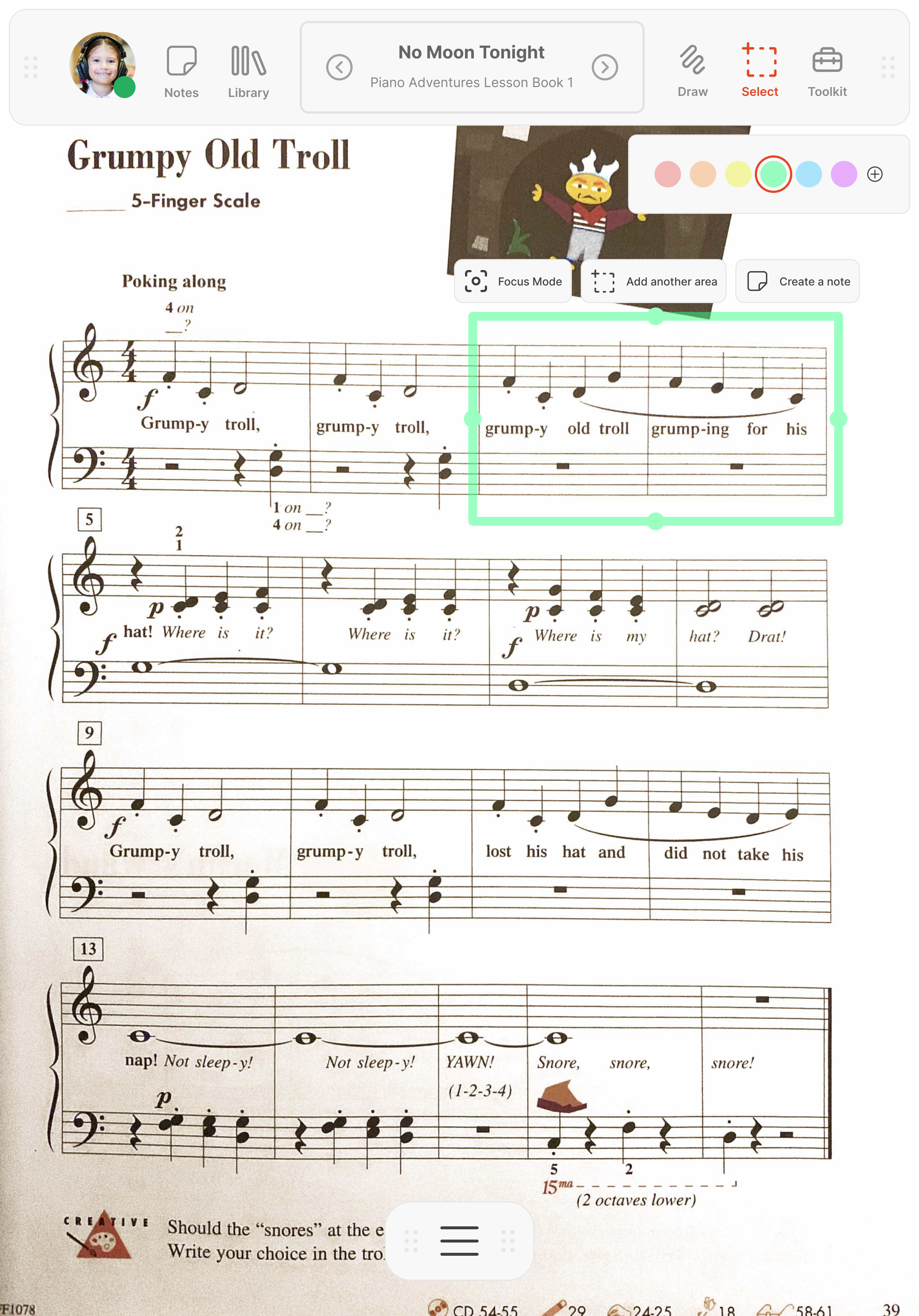
With the select area tool, the teacher can select an area of music to attach lengthier notes, audio/video, or use the focus mode to blur the surrounding area to help visually guide the student.
Conclusion
TAKEAWAYS
Approach research differently
To keep the interview setup simple for voluntary interviewees, I opted for Zoom interviews. However, if I were to redo the research, I would observe teachers during their online lessons, either through screen recordings or in-person, to uncover additional pain points they might be unaware of and capture student pain points as well.
NEXT STEPS
Designing the student experience
Due to time limitations, I focused more on the teacher experience for this project. However, a clear next step would be to research, design, and test the student experience.
Adding gestures for greater efficiency
To promote efficiency when accessing different tools, I would also consider incorporating intuitive and memorable stylus gestures for teachers within the app. For example:
- Tap with stylus: activates drawing tool
- Tap and hold: activates eraser
- Double tap and hold: activates select area tool

