Designing donation content to drive donor engagement
Designing and integrating donation content into the lender portfolio to deepen users’ understanding of their donations’ impact.
MY ROLE
UX/UI Designer
TEAM
Product Manager
Software Engineer
TIMELINE
August 2023 - 2 weeks
CONTEXT
About Kiva
Kiva is a nonprofit organization that provides a platform for crowdfunded microloans to help underserved communities globally.
Users worldwide can contribute as little as $25 to a borrower's loan on Kiva's online platform.
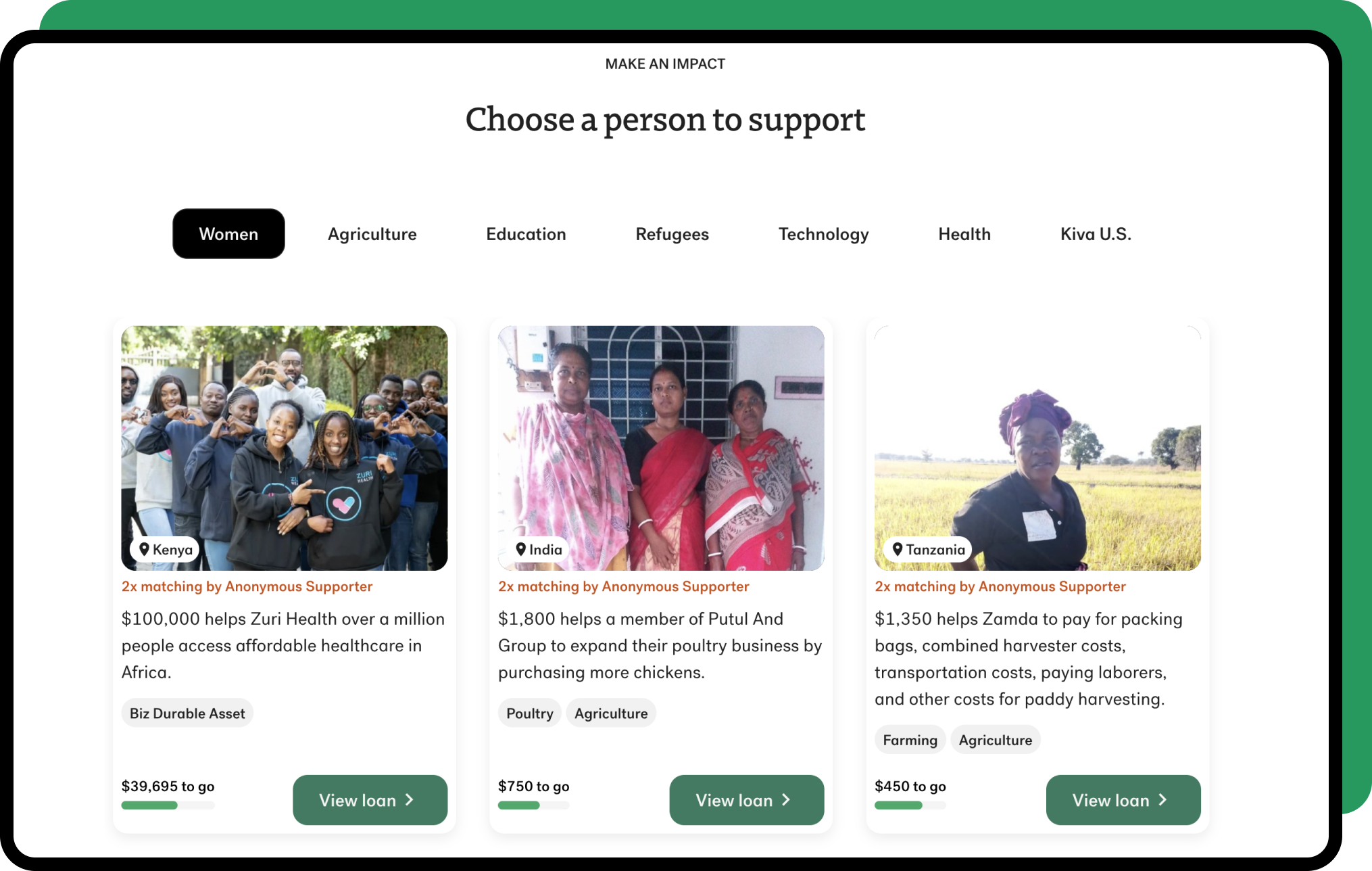
Donation "tips" at checkout
In addition to lending, Kiva users have the option to leave a voluntary donation "tip" during checkout to help cover Kiva's operating expenses.
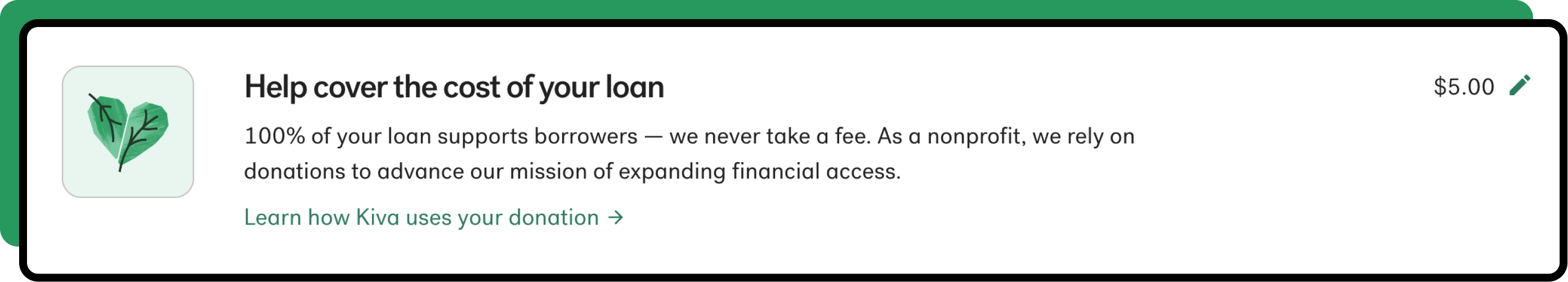
The donation is automatically added as an editable line item at checkout
DEFINING THE PROBLEM & SOLUTION

A new content strategy to increase donations
My previous user research informed a new site-wide content strategy, focusing on educating users about Kiva's behind-the-scenes work and initiatives in order to encourage more donations.
The challenge
Design and integrate a “donation education moment” into the lender portfolio that highlights Kiva’s most recent initiatives and achievements while also maintaining easy access to existing information.
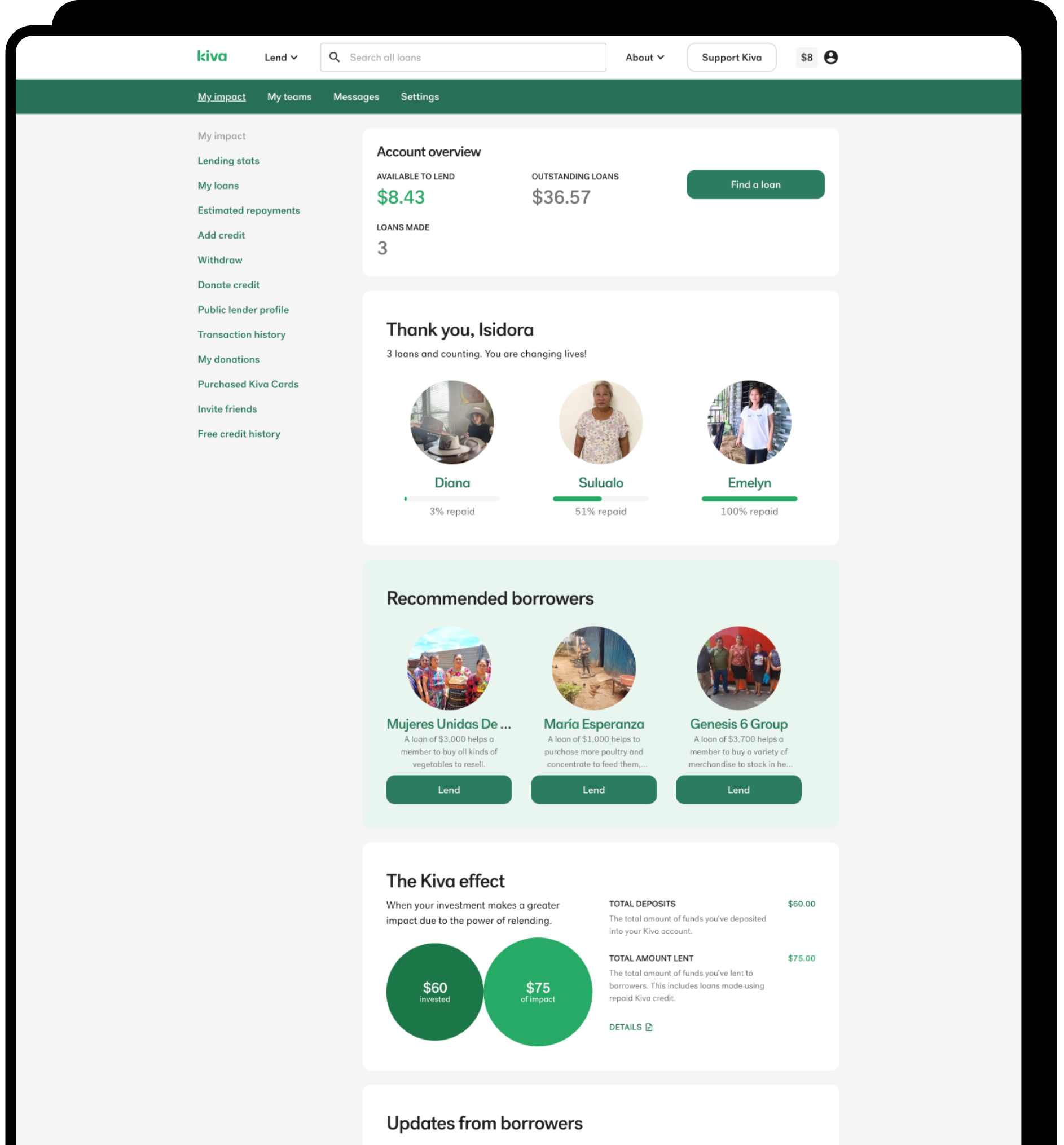
Previous lender portfolio
Guidelines for effective donation content
Our previous research gathered lender feedback on various donation messages. The product manager used these findings to create content guidelines.
Focus on Kiva’s achievements, not lenders' achievements
Focus on impact of donations, not a donation ask
Language is accessible and free of Kiva jargon
Keep content bite-sized and link minimally
Should not distract from core tasks on the page
DESIGNING THE SOLUTION
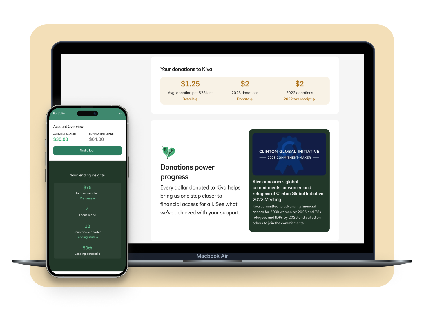
Designing the "donation education moment"
To keep the project lean, the content for this component was sourced from existing blog posts.
My initial ideas created ongoing work for the design and copyrighting team so we went with a solution that used the existing blog image, heading, and summary line to eliminate any need for bespoke copy and graphics.
Initial ideas
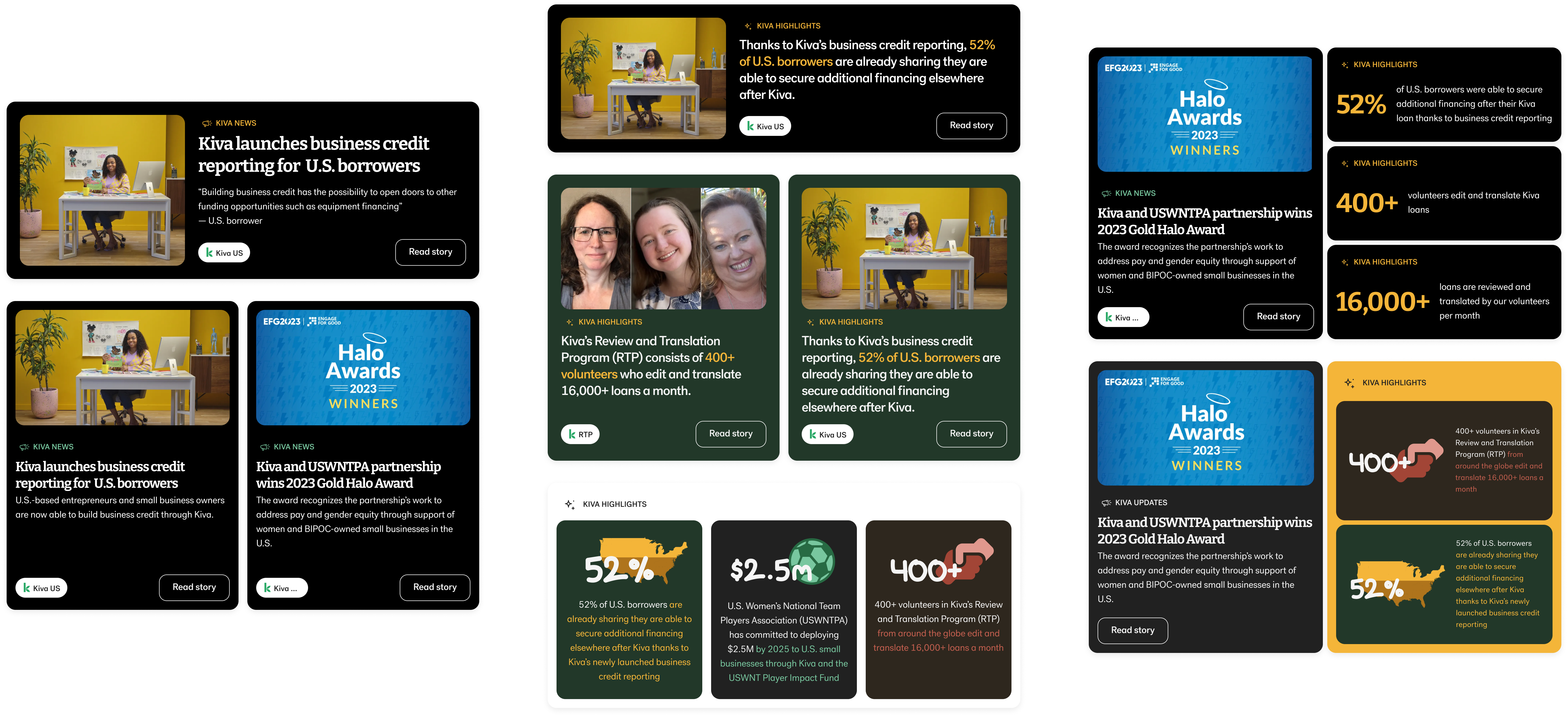
Final design
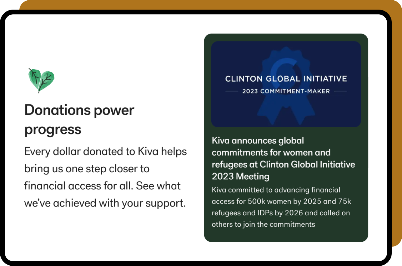
Adding a donation activities section
In the previous portfolio, donations weren't clearly mentioned anywhere so it was difficult to find an optimal placement for the donation education moment.
We added a "Donation Activities" section to give more context and used a gold color palette to make it stand out from the lending content since users often conflate "lending" with "donating".
Users can quickly access their past year’s tax receipt and the donation page
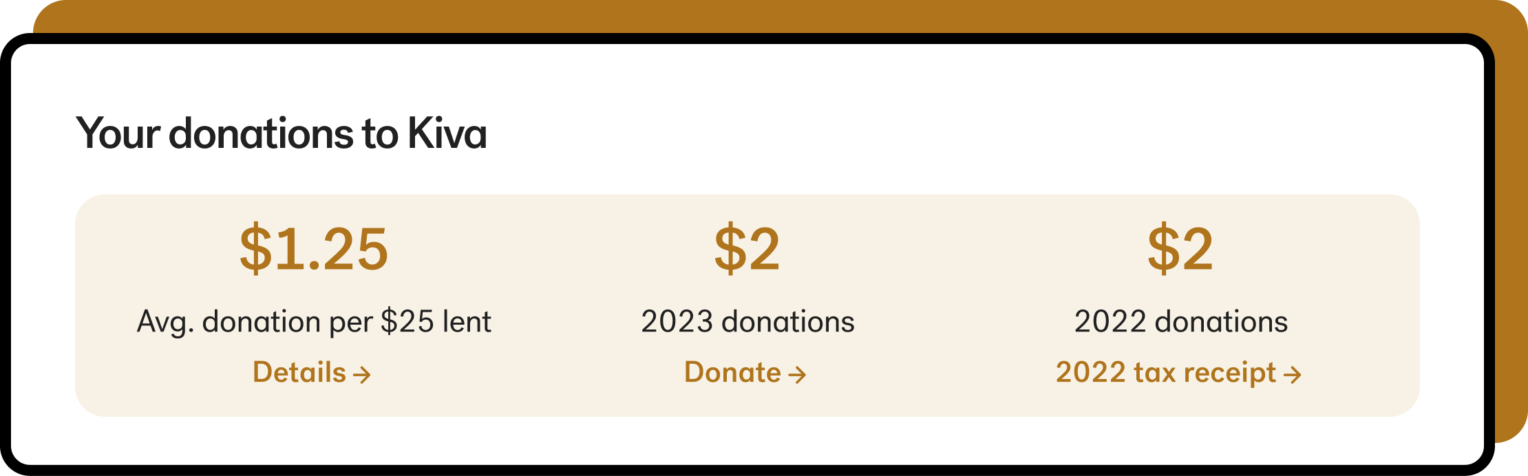
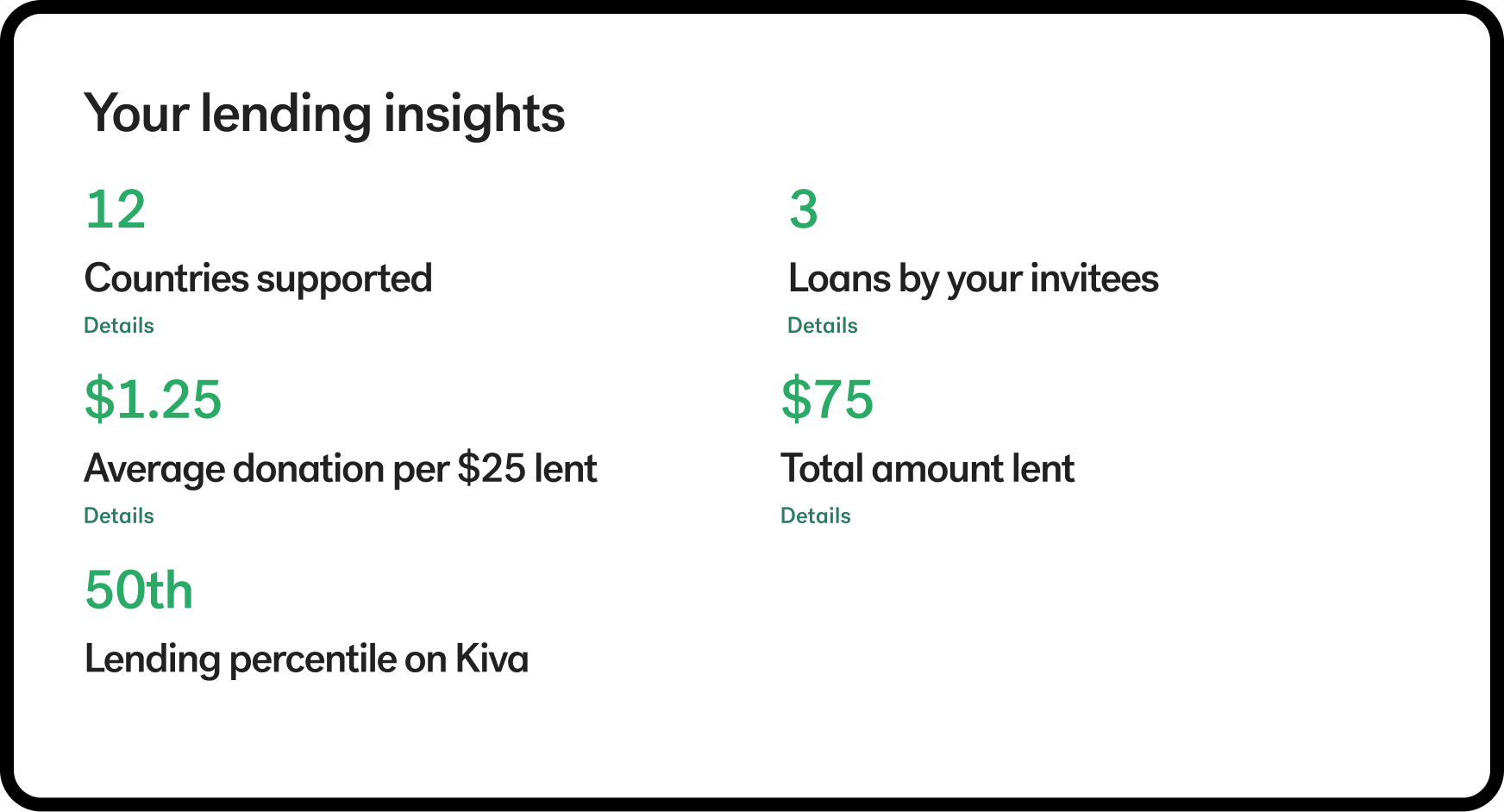
Re-designing the lending insights section
To free up some space on the page, I redesigned the lending insights section to be more compact, reordering and removing some of the statistics.
Previous
New
The "Details" links were replaced with more descriptive links
Re-organizing content
The more compact lending insights section was moved up the page, and the under-performing "Recommended Borrowers" section was removed. This change kept the lending content prominent while making the new donation sections more discoverable.

The final solution
Before
After
TESTING THE SOLUTION
Next steps: measuring impact
Unfortunately, I was unable to see the impact of my design before my internship ended. If I had more time to follow up I would:

Compare the donation revenue after the launch to the revenue from previous years during the same period
View live user session recordings to see if and how users are engaging with the new content
TESTING THE SOLUTION
Next steps: measuring impact
Unfortunately, I was unable to see the impact of my design before my internship ended. If I had more time to follow up I would:
Compare the donation revenue after the launch to the revenue from previous years during the same period
View live user session recordings to see if and how users are engaging with the new content
LEARNINGS
Designing a flexible & low-maintenance component
One lesson I learned from this project was the importance of creating a component that was flexible enough to accommodate different heading lengths and image sizes and remained low-maintenance and did not create additional work for other teams.