overview
CONTEXT
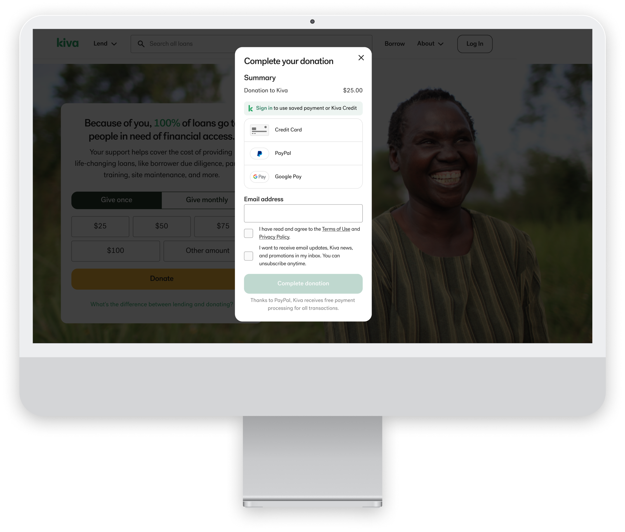
Donation "tip" at lending checkout
In addition to lending, Kiva users have the option to leave a voluntary donation "tip" during the checkout process or contribute a standalone or monthly donation to help cover Kiva's operating expenses.
PROBLEM
Approximately 40-45% of users who initiate a standalone donation to Kiva do not complete their donation. How can we improve the user experience of the standalone donation checkout in order to reduce the drop-off rate?
ROLE
UX Designer
TEAM
Product Manager, Software Engineer
TIMELINE
October 2023 - 2 weeks
Understanding the Problem
USABILITY ANALYSIS
Evaluating the current donation checkout flow
To gain a deeper understanding of the current user experience, I went through the standalone donation checkout myself and made notes of any points of friction.
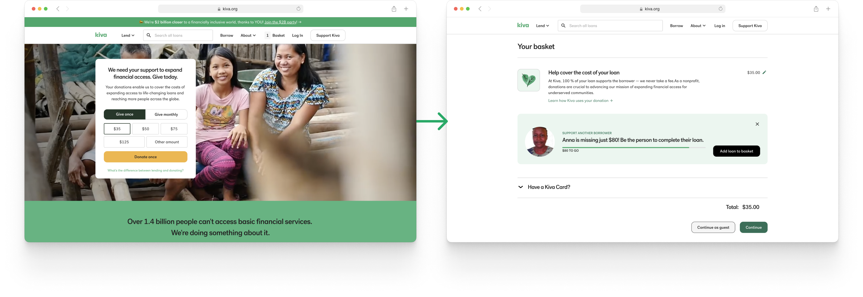
Donation checkout confusingly framed as a loan add-on: After clicking "Donate," users are taken to the checkout page for loans. The donation is presented as an optional "tip" to cover loan costs, rather than a clear standalone donation.
Guest checkout hidden for some users due to browsing data: The "Continue as Guest" option only appears if the site has no browsing data indicating a previous logged-in Kiva user. So users trying to check out with a new email address, not associated with an existing Kiva account, may not see the "Continue as guest" option.
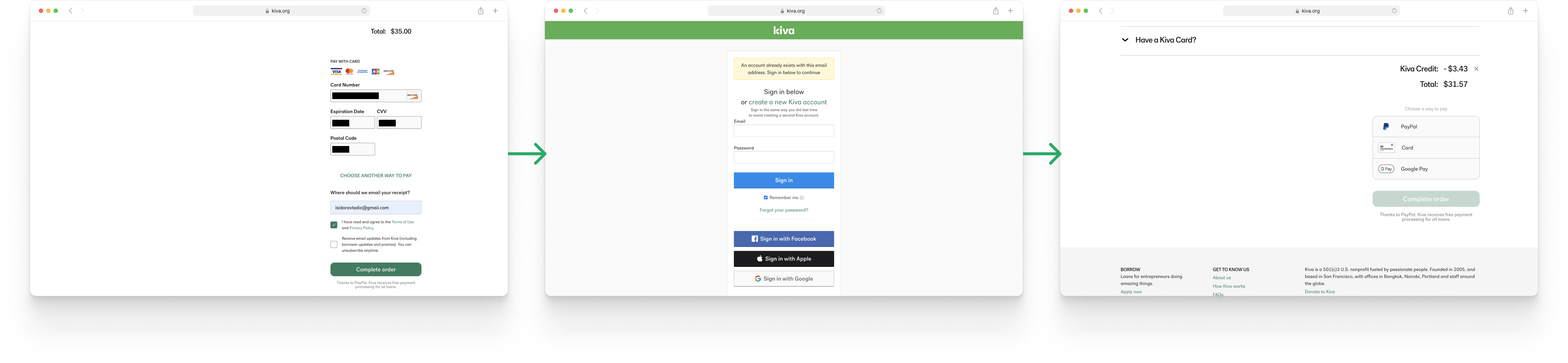
Guest checkout creates extra friction for users with existing accounts: When a guest enters an email already associated with a Kiva account, they are prompted to log in after inputting payment information. This requires re-entering payment details after logging in.
PAST RESEARCH
Recurring login issues among lenders
Past surveys and interviews revealed that users, particularly infrequent users, regularly struggle to remember and reset their passwords when using the site.
"
Improve your UX. I'm a believer but I can never sign into my account without a problem. I've just given up and am not going to lend any more because, well, I just can't sign in.
Lender NPS Survey April 2023
"
Help me reset my password without asking for personal details over email.
Lender NPS Survey August 2023
Ideation
USER FLOWS
Exploring different user checkout flows
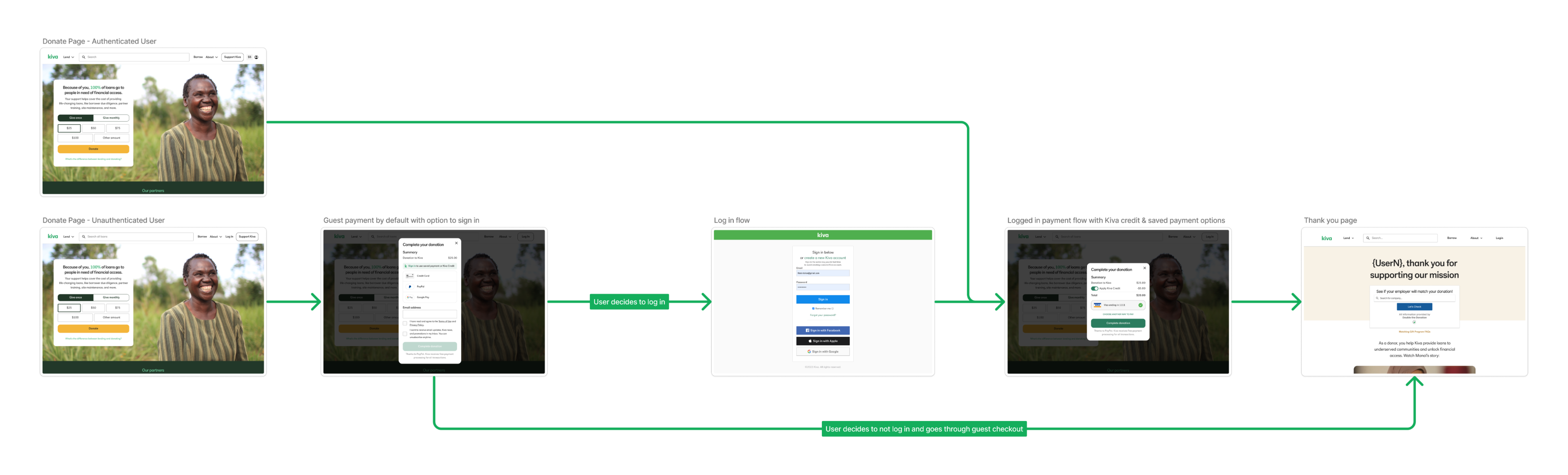
To address the problem of users being directed to the confusing loan checkout flow, we decided to go with an on-page modal donation checkout, similar to the monthly donations checkout flow. Since most components were already designed, the focus became identifying the optimal user flow.
Before involving engineering, I outlined multiple user flows to eliminate or alleviate identified friction points. I then presented these options to the engineering team so we could determine feasibility.
Flow #1
Email input comes first to catch existing users
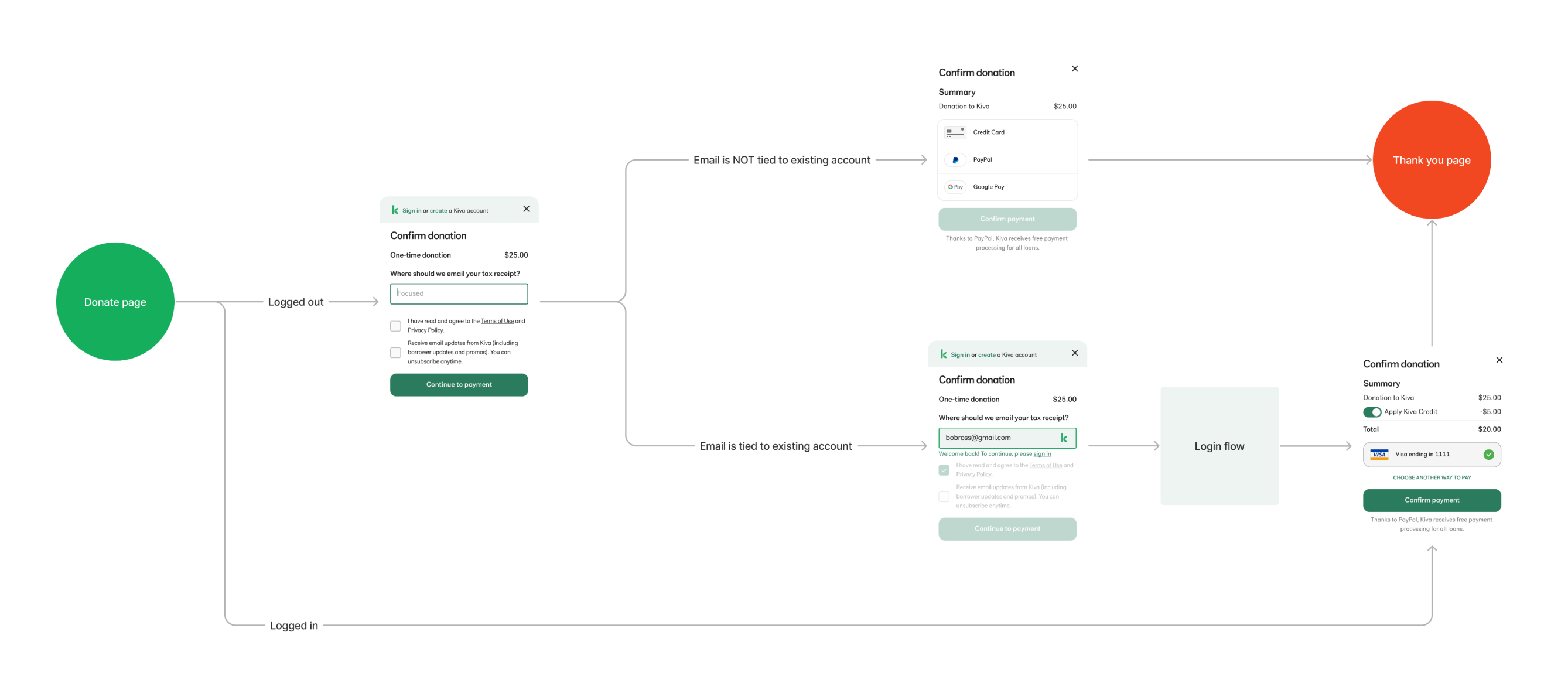
Flow #1: Users would be asked to provide their email for their tax receipt first so that we can verify whether they are existing users and prompt them to sign in before they begin entering payment info.
Risk: This flow creates a security vulnerability, as malicious users could exploit the account verification step for username mining.
Flow #2
Login prompt comes after payment input
Flow #2: Ask users to input payment information first before verifying if they are a new or returning user. By having users invest effort upfront to enter payment details, they will be more inclined to complete the transaction rather than abandon it and "waste" that effort. Users' payment details should be automatically repopulated after logging in to provide a smoother user experience.
Risk: If users' payment details aren't able to be temporarily saved for post-login, this flow does not offer an improved user experience for existing users.
Flow #3
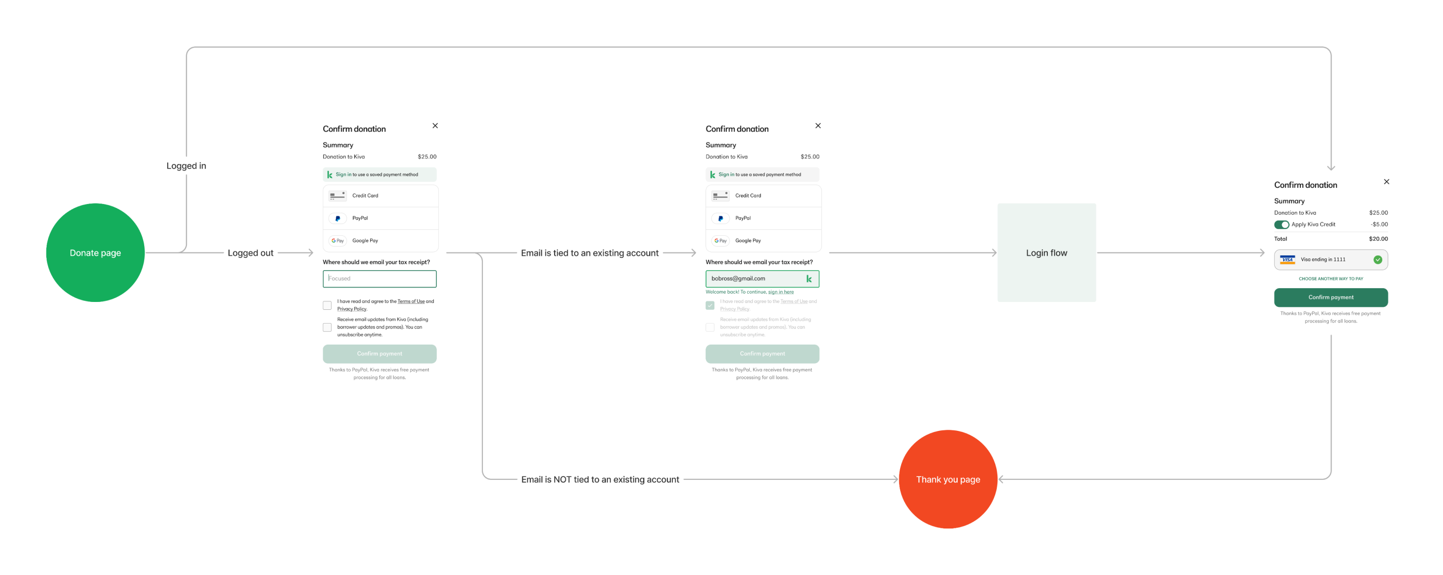
Eliminate login requirement for existing users
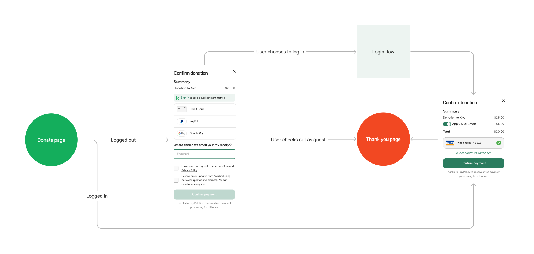
Flow #3: Entirely eliminate the need for existing users to login while still offering the option for login to use account benefits like Kiva credit and saved payment methods.
Risk: If guest emails can't be linked to existing accounts, users won't see their donation when logged in later.
The Final Solution
Flow #3 as the final solution
Conclusion
IMPACT
Allows for more placements for donation checkout module
With the standalone donation checkout now available through an in-page modal, the donation module can be placed on various site pages, such as blog posts. This enables users to make a donation without having to navigate to a different page, allowing them to resume their Kiva experience immediately after checkout.
NEXT STEPS
Creating an in-modal thank you page
If the donation checkout module is placed on other pages, it would be ideal to design an in-modal version of the thank you page. This way users won't be redirected away from the page after completing a donation, enabling them to smoothly continue their Kiva experience.
TAKEAWAYS
Early communication with engineering
Initially, I had assumed that creating a guest checkout option for all users was not possible due to the way guest checkout is limited for lending. Had I been in communication with engineering and found out this was possible earlier, I could've reduced my design time and presented the third flow as a solution sooner.